< Back To Projects or view next project: Air Quality Map >
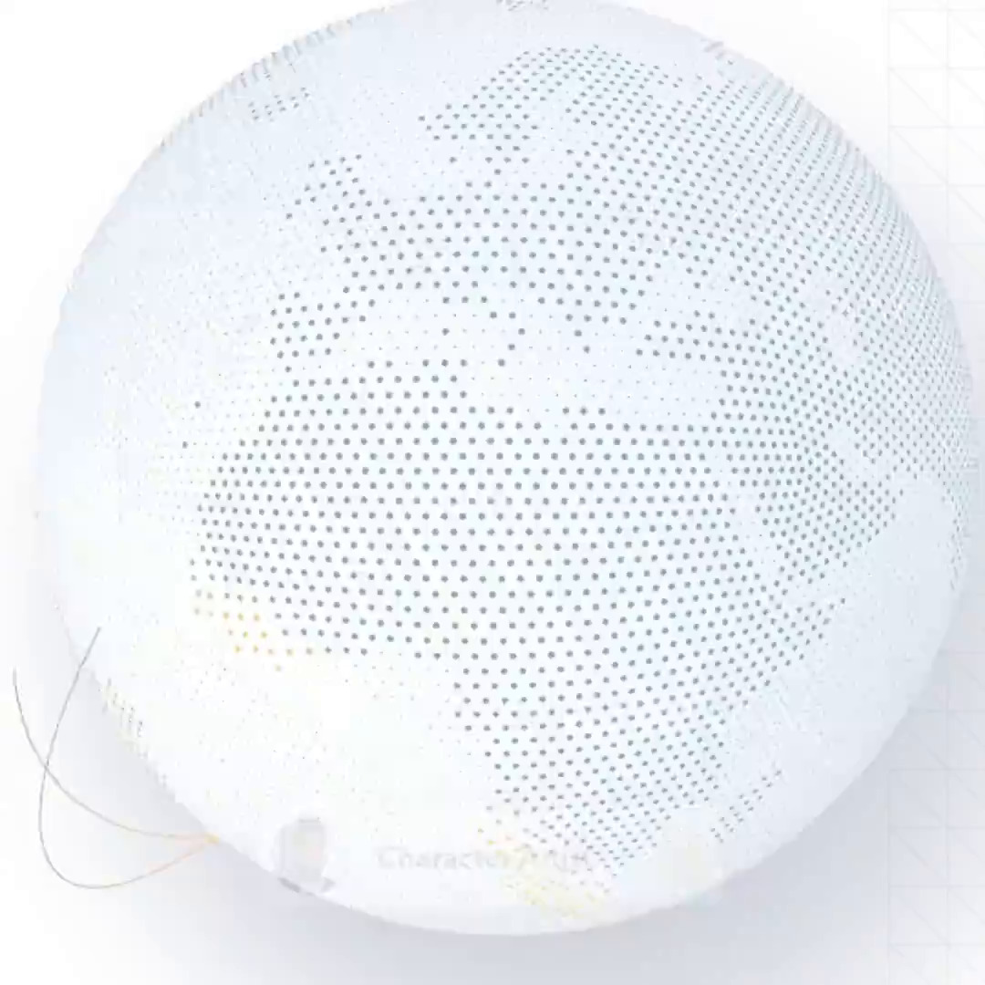
Mindtrust Globe

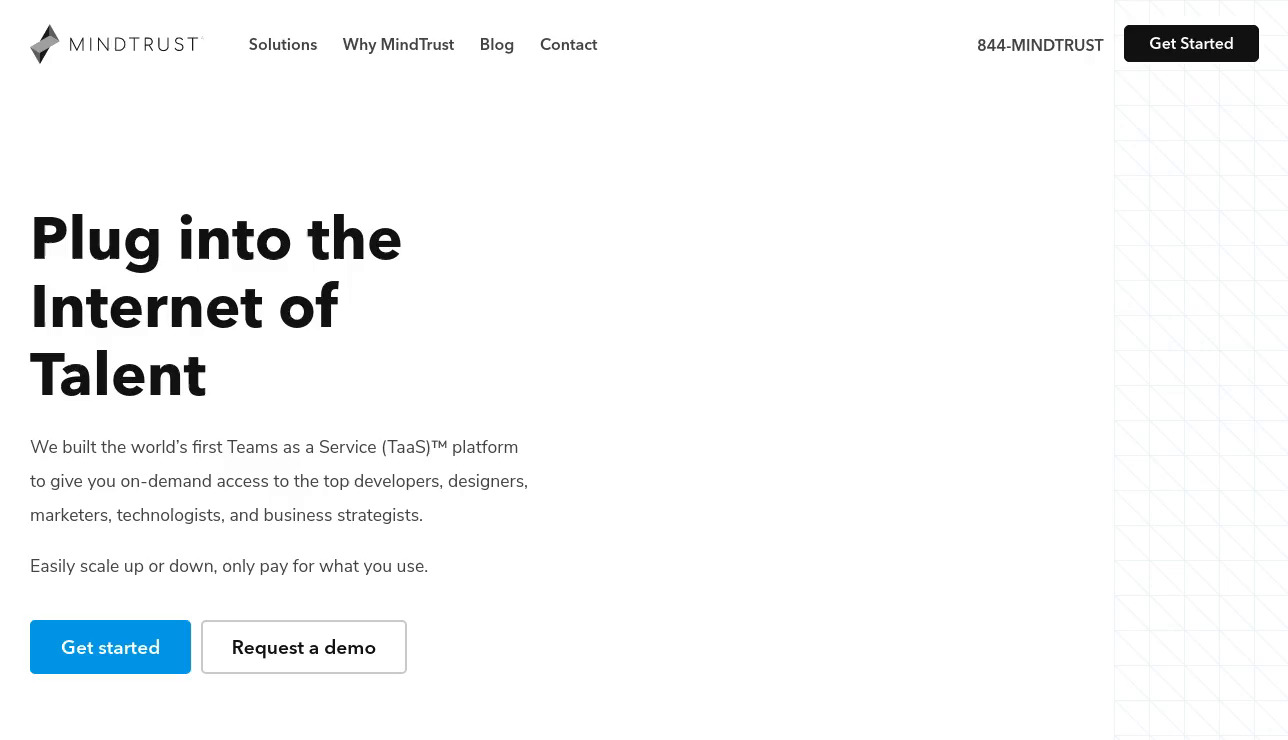
Mindtrust was looking for an animation on their site that would showcase how efficiently they assemble worldwide teams.
The challenges
They had several goals with this project:
- It had to gently get the audience's attention, so that they would peak at the globe without being distracted from the rest of the content.
- It should emphasize that Mindtrust is excellent at building teams quickly.
- We needed some yet undecided effect when connections are made, to give the feel those have a positive impact on the team's mission.
- The globe needed to rotate smoothly, following the connections as they are created.
- And of course, this should all load up quickly!
The first challenge we overcame is finding the choreography. We had to figure out where we would place the dots representing the team members. We planed those locations anticipating the arcs that join them, aiming to create rhythm. We also defined how quickly arcs would be created in between them and what effect we wanted to see once an arc was completed. And finally, to view all this correctly, how would the globe rotation be; should it be smooth or sharp, should it precede the arc or should it follow? Coordinating those elements to make it feel like a cohesive whole was the key to this project.
The ripple effect

Creating the ripple effect is probably what had the most impact on this piece. It is visually very present and ties up 2 arcs together. And as most things go, it was the most technically delicate to achieve.
We decided to create a custom material for it, using our custom WebGL engine. It would drive the movement of the small disks inside a vertex shader (yes, each small dot you see making up the continents are not dots, that would not look good enough, we instead used disk instances). We also added some noise to add an organic feel to the ripple. And the shader uniforms would be animated using animation nodes.
It was definitely the element that required the most iterations. If the color was slightly too saturated, it would drive attention away from the team members appearing. If the animation was too quick, it would be hard to read what was going on. If it was too slow, it was too dull and boring.
Once we had this part nailed, the animation of the other elements fell into place. We could then finalize the lighting on the globe, to have this soft and gentle palette, which would integrate well with the rest of the page.
< Back To Projects or view next project: Air Quality Map >