< Back To Projects or view next project: Mindtrust Globe >
Apparel Gallery
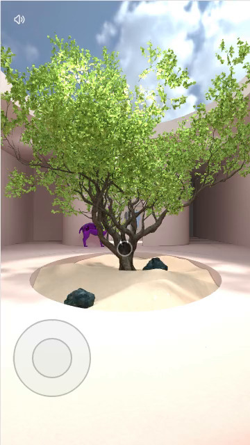
The goal of this project was to immerse visitors in a surreal and calm place, where they would discover clothes they could purchase.
The space
In collaboration with David Carrico’s vision and creative direction for the project, the space was designed by the very talented artist Leebecca. One of the first tasks was to take her scene, created in Blender, and reproduce it in WebGL, so that it could work on mobile devices.
We imported all the assets she created into Houdini. As those were designed for offline rendering and were too heavy for real-time WebGL, we had to rework geometries. The first part of the process was to simplify them while keeping the look. Next, we unwrapped the UVs to create light maps, using Octane. We then ended up with very lightweight geometries and textures, totaling less than 10Mb of data sent to the browser. We then used our custom WebGL engine to assemble the different geometries, to make sure each material had the right texture, and to check the color space of each element. We could then have a WebGL setup very similar to the original design.
The tree was a specific element that took some time to figure out. The difficulty here is that it is made of hundreds of thousands of polygons, where each leaf has a specific texture. But in our tests, using those made the experience very slow to use. So we reverted to using simple quad polygons for those.
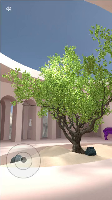
A llama was also a very important element to integrate. And it certainly brought a lovely and quirky feel to the experience. Thankfully, it was a pretty easy element to add to the scene. The main part we focused on was its reflections, which were done using a cube map, generated once the environment was loaded.
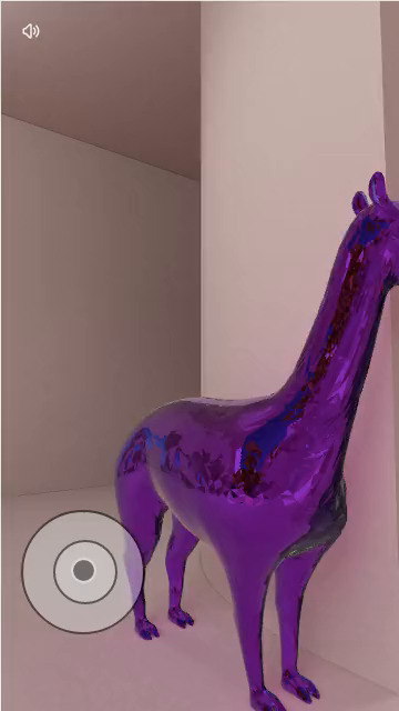
Once the space was usable, we needed to give a way for visitors to move around. For that, we created custom mobile controls, where users could use one finger to rotate the camera and another to translate it. This took a few iterations to get the right speed in both rotation and translation, and in both landscape and portrait mode.
And we also ensured people could not go through walls, as this could be very confusing. We therefore developed a collision system. And each time the visitor moves, we test collision against a very simplified geometry.
Surreal feel
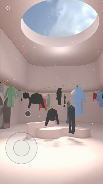
It was also important to ensure that the place did not feel sterile, a flaw that most computer-generated environment often have. Using cloth simulations to add floating drapes is one way to achieve that, but those require a lot of processing power, so we decided against that. We then opted for much simpler - but still very effective - solutions, like floating particles.
Bubbles popping
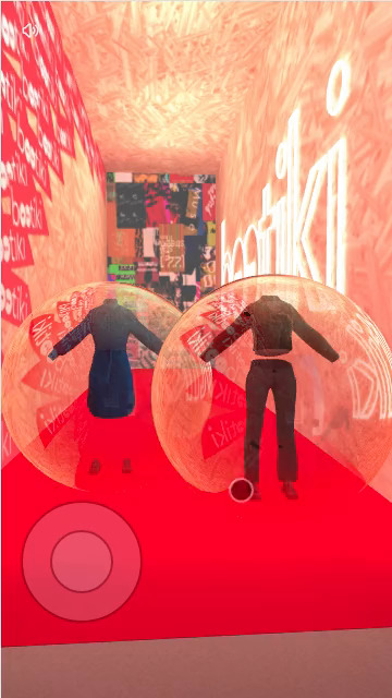
When visitors decide to view more details about a specific piece of cloth, they have to tap on it. That's a completely standard action. But in this case, clothes are contained within bubbles. That's still simple, we thought, no big deal. A bit of fresnel in a custom material, a bit of reflection like we did with the llama and we're done. But then we're asked to make those bubbles pop. That raised the difficulty bar a notch.
For this popping effect, we pushed what we could do with custom shaders. We used a combination of different noises, and have the material alpha defined by a threshold crossing that noise. And synchronised with this, the geometry of the sphere making the bubble deform just a bit to give the impression it is exploding. This effect was therefore created by both vertex and fragment shaders.
< Back To Projects or view next project: Mindtrust Globe >